One of the questions that you face as a developer when implementing Google+ Sign-In (or any login method) is how to present the options to the user. Having reviewed a pretty large number of apps with sign-in, I thought it might be helpful to break down the four main approaches for displaying the buttons that I've seen, and some thoughts on the costs and benefits of them.
A couple of points before we get into that: It's worth remembering that the best situation is when the user does not have to take any action at all. That's the idea behind cross platform single sign on and over-the-air installs. It's also why it is worth taking the time to make sure users stay signed-in after an app upgrade or releasing a new version of a website.
Secondly, unless there are solid reasons not to, sign-in should always be paired with sign-up. Particularly on mobile devices this can be a missed opportunity where users are expected register on the web first. That said, in this post I want to focus less on the whole flow, and more on how and where you present the sign-in option initially.
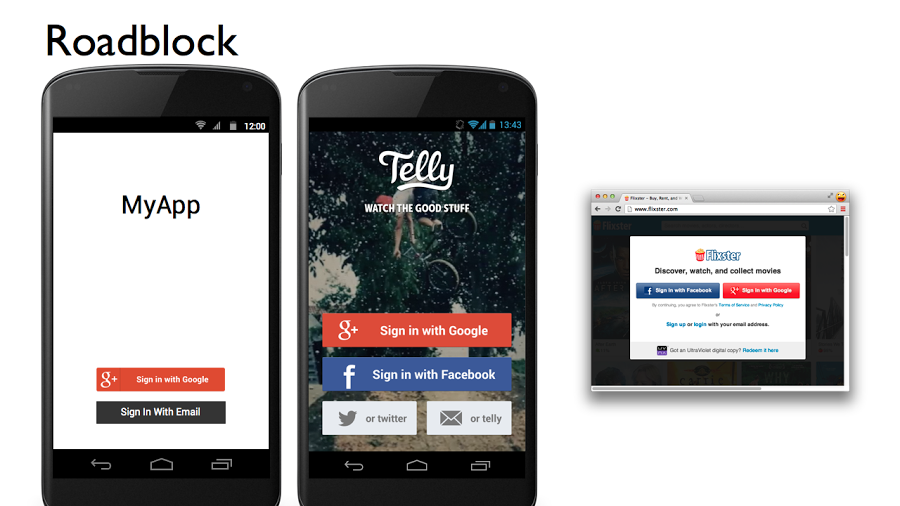
1. The Roadblock

In a roadblock the sign-in screen is presented up front to the user, and the only way that they can continue to use the app is to authenticate. There are some benefits to it - from a development point of view it means no time has to be spent considering anonymous users, and from the business point of view all of the benefits of a seamless experience and the ability to connect a users' actions across platforms are compelling. That said, there is a significant cost in doing this: it forces the user to immediately decide whether the app is worth signing in to, and the likely result of them not being sure is to uninstall the app or close the window. It is like someone demanding your ID as soon as you step through a door - sometimes its the right choice, but it never feels friendly.
The two examples above are Telly (on Android) and Flixster (on the web). In both cases, the applications could offer experiences for signed-out users, but have made the decision to force their users to sign-in before accessing.
There are some valid reasons for doing this. Some applications really don't make any sense without authentication - such as a banking app. In some cases the value of or for a signed-in user is so much higher that it is worth losing users who won't sign in. An app like the document scanner Doo has some value for anonymous users, but without connecting it to a cloud backend to save documents to it is a little precarious. Sometimes the roadblock is the right choice purely from the perspective of saving development time - but in that case the decision is definitely worth revisiting as the app matures.
The other downside of this technique is that it is very difficult to effectively convey why a user should sign-in in. One of the reasons this approach is more prevalent on mobile is that the user has already decided to download the app, and so has slightly more of an impression of what it might do for them. On the web, a roadblock is generally the first thing you see.
Nick, Roman and Adam rightly came down hard on this approach in a recent Android Design In Action. If you are considering it for your own application it's worth also looking at some of the other options. Be explicit about what you, and the user, are getting out of the exchange.
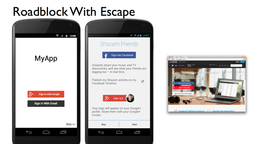
2. Roadblock with escape road

The more common technique for the web is to present sign-in like a roadblock, but allow deeper exploration via an escape route. This can recapture some of what would have been bounced traffic, and allow users to explore further while still heavily promoting the signed-in experience. Deezer are a good standard example for this on the web. They present sign-in as the primary action on the page, but allowing users to go deeper into the site via the search button. In case you can't access Deezer (sorry USA!), Soundcloud have a similar approach, though they make the exit routes more prominent. The choice of how much prevalence to give various elements is going to depend on the relative value of anonymous and authenticated users. In general there's a fairly granular sliding scale between the full roadblock and the convenience sign-in setup as described below, trading some percentage of lost views for some percentage of increased sign ins.
On mobile this technique is slightly less common, particular on Android where it is possible to request access to some kind of stable identifier simply by requesting the GET_ACCOUNTS permission on app install. The skippable roadblock is more common for social sign-in though, with Shazam's gorgeous new Android app being a prime example. Here again the social sign-in is presented as the primary action, but the user is given the option of avoiding it.
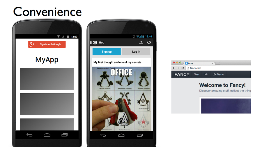
3. Convenience Sign-In

Sometimes sign-in is beneficial to the app, but not enough that you want it to get in the way of the user's experience. In that case, putting sign-in where it is visible but not intrusive can be a nice compromise. For example, many websites have a login or signup button in the top navigation, and users expect to find that feature there. We can see this on The Fancy, where the sign-in is prominent but certainly not getting in the way of the shiny things in the content. On mobile there isn't as much of a convention to follow, but 9gag provide a decent example by placing the sign-in option at the top of their stream where users will see it, but aren't pressured to sign-in. In this way sign-in is offered as a convenience.
Occasionally this option is included primarily for existing users, rather than to convert new ones. In this case it is accompanied by other, more direct techniques for presenting the sign-in option (mainly option 4 below). If it is the sole driver of sign-ins it usually indicates that the value of sign-in to users is low. Managing a user database and sign-in options requires effort, and if there isn't value for the user in registering then it is best either to not spend the effort on having a user sign-in at all, or to focus it on their areas where there is value. A common place to find this kind of problem is on magazine or newspaper sites, particularly smaller ones, where the main sign-in value is managing subscriptions but the site or app spends effort spreading the functionality across the entire product.
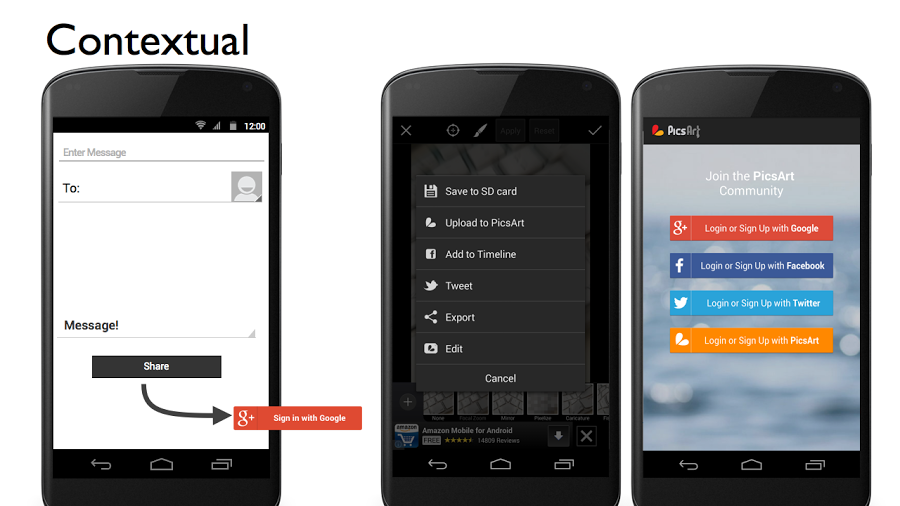
4. Contextual

The final method is to present the sign-in only at the time the user takes an action that clearly requires it. This is one of the most effective methods for converting viewers to users. They have already taken an action, and are presumably seeing some value from the application.
Picsart do this beautifully. The app allows you to take and modify photos right away. When it comes to posting them up for others to see them you are then prompted for the sign-in. To the user, the request is motivated by the action they took, so there's not a lot of explanation needed for why they should sign-in.
Just as with the roadblock, this can be accompanied by a skip option if the sign in is merely optional. For example, many eCommerce sites allow a user to create an account or sign-in at checkout, but also allow manually entering the order details without creating an account. In that case, a smart option may be to allow simpler account creation afterwards, once they have already entered all their details.
Where this technique can fall down is if there are small core of active users, but a larger base of mainly passive users. While offering more light-weight endorsements can encourage the passive users to interact more (e.g. +1 an item), it also provides much less incentive to sign-in: if I've presented with a dialog when I press the endorse button, I might just hit back. In this case either increasing the value to passive users or more prominently promoting the sign-in option may be a way to capture a higher percentage of the user base.
What to use?
The core questions to keep in mind when choosing how to present sign-in to users are:
- What benefit does the sign-in give the user?
- How can I best communicate this to my user?
- How much do I value a user being signed-in vs being anonymous?
The answers may well vary per-platform, but the best apps will always have a strong benefit for both the user and the app of being signed in, and be able to clearly and quickly demonstrate that.